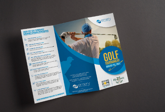
Marketing Brochure Design Tips for Success and Impact

Creating a captivating marketing brochure is like crafting a visual story that not only informs but also leaves a lasting impression. However, in this competitive world to leave a lasting impression is pretty tough. But, worry not with custom brochure templates, you have the power to customize every aspect of your design according to your brand identity, target audience, and marketing goals in minutes. These templates not only provide a solid foundation for your brochure but also offer the flexibility to tailor it to your specific needs. In this guide, we’ll explore a set of essential marketing brochure design tips to ensure your materials stand out and make a significant impact on your audience.
Impactful Marketing Brochure Design Tips
Understanding Your Audience
Connecting with Readers:
The first step in designing an impactful brochure is understanding your audience. Consider who will be reading it—what are their interests, preferences, and pain points? Tailor your design to resonate with your target demographic.
Age-Appropriate Design:
If your primary audience includes younger readers, opt for vibrant colors and playful imagery. For more mature audiences, choose sophisticated fonts and a clean layout.
Establishing Clear Objectives
Defining Purpose:
Before diving into the design process, clearly define the objectives of your brochure. Are you promoting an event, showcasing products, or providing information? A well-defined purpose guides the entire design strategy.
Call-to-Action (CTA):
Every brochure should have a clear call-to-action. Whether it’s visiting a website, making a call, or attending an event, guide your readers on the next steps.
Compelling Visual Elements
Eye-Catching Imagery:
Use high-quality, relevant images that capture attention. Visual elements play a crucial role in conveying your message. Choose visuals that complement your brand and evoke the desired emotions.
Infographics for Clarity:
Complex information is better understood with the help of infographics. Use simple charts or graphics to present data and statistics, making it easier for readers to grasp the information.
Thoughtful Typography Choices
Font Harmony:
Consistency in font choices creates a polished look. Select fonts that align with your brand personality and are easy to read. Experiment with font pairings to create visual hierarchy.
Readability is Key:
Ensure that your text is easily readable. Choose font sizes and styles that enhance readability, especially for important information. Consider the overall aesthetics when deciding on typography.
Embracing White Space
Balancing Elements:
Don’t underestimate the power of white space. It provides a visual break, making your content more digestible. Avoid clutter, and allow for ample white space to create a clean and organized layout.
Enhancing Focus:
White space directs the reader’s focus to key elements of your brochure. It helps prevent visual overload and ensures that your message is conveyed with clarity.
Consistent Branding
Brand Recognition:
Maintain consistency in branding elements throughout your brochure. Use the same color palette, logo placement, and overall design style to reinforce brand recognition.
Align with Style Guide:
If your brand has a style guide, adhere to it. Consistent branding across all materials strengthens your brand identity and fosters trust.
Choosing the Right Format
Print vs. Digital:
Consider the format that best suits your objectives. While printed brochures offer a tangible experience, digital formats allow for interactive elements. Choose the format that aligns with your audience’s preferences.
Interactive Features:
In the digital realm, explore interactive features like clickable links, videos, or animations. These elements can enhance user engagement and provide a richer experience.
Testing for Effectiveness
Pilot Testing:
Before mass production, conduct pilot testing. Share your brochure with a small group to gather feedback on its effectiveness. Use this input to make necessary adjustments and improvements.
Analyzing Response:
Track the response to your brochure. Monitor website visits, inquiries, or event attendance resulting from your brochure. Analyzing these metrics helps gauge the effectiveness of your design.
Keeping it Simple
Clarity Over Complexity:
Simplicity in design is often more impactful. Avoid overwhelming your audience with too much information or intricate designs. Focus on a clear and concise message.
User-Friendly Layout:
Ensure that your brochure is easy to navigate. Use headings, subheadings, and clear sections to guide the reader through the content effortlessly.
Staying Current with Trends
Embracing Modern Elements:
Keep your design fresh by incorporating current design trends. This might include using modern color palettes, trendy fonts, or innovative layouts. Staying current demonstrates your brand’s relevance.
Adaptability:
While trends are valuable, also consider the timeless aspects of design. A balance of modern trends with enduring design principles ensures a brochure that remains impactful over time.
Also Read:
7 Tips and Tricks for Increasing Sales and Growing Your Business
Conclusion
Designing a successful marketing brochure involves a strategic blend of creativity, understanding your audience, and adhering to effective design principles. By implementing these marketing brochure design tips and using free marketing brochure templates, you can create brochures that not only inform but captivate and leave a lasting impact on your audience in just a few clicks. Remember, a well-designed brochure is not just a piece of information; it’s a visual representation of your brand’s story, making it an invaluable tool for successful marketing endeavors.
Read More: Sciatic Nerve Pain


