
The logo is often the first element of branding that a potential customer sees. It must make an impression and stick in memory, causing the necessary associations and interest.
Perhaps the most important aspect of your logo will be the color palette you choose. A good logo is universal, and there are no rules about which color is preferable.
Choosing a color for your design
You can choose shades using a color wheel or services like Adobe Color CC, Paletton or logo creator online Turbologo. But in the case of a logo, you should pay attention to other nuances:
- Compatibility with different backgrounds. You can’t be aware where your logo will be exposed or what colors will surround it, so it’s worth choosing shades that are as versatile as possible. For example, the white Supreme logo looks awesome on most backgrounds.
- Rule 60/30/10. The optimal ratio of shades in the logo palette is considered to be the following: 60% is the main color, 30% is an additional color, 10% is an accent or shadow color.
- Start with black and white. Many designers prefer to build the “carcass” of a logo in the form of a faded sketch in order to better think through the structure, shape and relationship between elements.
When we look at any object, we first evaluate only two parameters: shape and color. Here our job is to transform the essence and idea of the brand as succinctly as possible into the form and color that will win this race for the attention of the audience.
Choosing font
Logo typography is a separate stage of its creation. If the brand logo is made in the form of the company name or contains it, it is worth considering a lot of details:
- Font. It should highlight the character of the product and reinforce its message.
- Optimal spacing between letters. Not too big so that the logo elements look cohesive, but with enough white space.
- Color. Coordinating shades that suit the character of the brand.
- A combination of text and icon – if they are located next to each other on the logo. It is important to consider the size ratio and the optimal distance between elements.
A large collection of high-quality fonts is presented in the Turbologo service.
Stick to Common Logo Types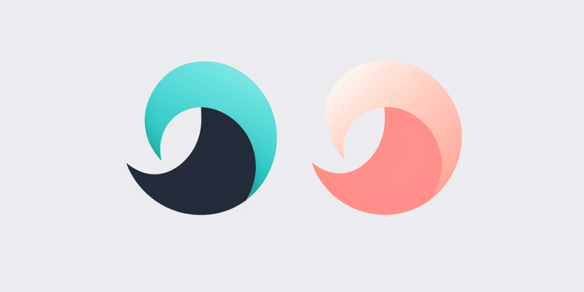
Types of logos:
A letter logo (monogram) consists of the first letters of the words of the company name (for example, NASA). This type is a clear and simple solution for companies with long names. Also, the small size of the symbol can make the brand more memorable. You need to take design seriously and use a font that best matches your brand.
A graphic sign consists of a symbol of a recognizable object without additional text. An emblem is used, thanks to which the company becomes recognizable. And the logo does not necessarily reflect what the business does. For example, Apple and Target use graphics that literally depict their name. The main challenge when creating a good graphic sign is to turn recognizable objects into a stylized symbol that is unique to the business.
Word marks are logos based on fonts and consisting only of the company name. Just like monograms, word logos work well if they are minimalistic and modern. For new brands or companies, this type of logo will be even better than an alphabetic one, as it spreads the full name out into the world.
Be in trends
Trends are the foundation on which a company can build its future strategy. This is a fresh look, a new trend and a non-standard approach to familiar things.
- Playful typography
Escapism is one of the design slogans of recent years. Users are looking for original, sometimes flashy, details, trying to see their own zest in each product. Many brands have embraced this trend and applied it to typography. Meet the new trend – playful text as a logo.
- Glitch effect
You’ve probably noticed this type of logo design from big brands more than once. At a minimum, this is the effect TikTok now uses in its icon. A clutter or glitch appends to the attractiveness of the design and makes a trendy logo look even more futuristic. In 2023, many companies and brands are taking note of this technique to attract the attention of younger consumers – it works especially well for this group.
- Gradients
Gradients have firmly entered the top logo design trends: they are also used to create website designs and banners. The most striking examples of brands that actively used gradients in their logos even before it became mainstream are Instagram and Adobe Creative Cloud. The advantages of gradients are obvious – they look harmonious on a variety of backgrounds, attract attention and look aesthetically pleasing. Everything indicates that this trend is with us for a long time.
Don’t decorate your logo with unnecessary details
Microsoft Windows is worth $63 billion, and the logo consists of four small squares that make up a window, proving that smaller is better. Do not limit your creativity to rigid boundaries – give freedom to your creativity, but do not forget about the essence, and it is always very simple and concise. The key to logo design is your core truth, not a flashy, fancy concept with frills all over it.